Providing a mobile-friendly website is very important because it boosts your sales and conversions. That’s because the website comes with an ease of accessibility surrounding this website design. Having a mobile-friendly website is one of the most effective ways to keep visitors on websites longer.
As you already know, people tend to stay more on a website that is easy to use, regardless of the type of device they are using. Therefore it is essential to have a website that performs well on a mobile device, so your visitors will have a positive experience while interacting with your website across devices without being annoyed or inconvenienced.
If you don’t know, smartphone traffic nowadays exceeds desktop traffic in many countries, so don’t waste your time anymore; make your website mobile-friendly now!
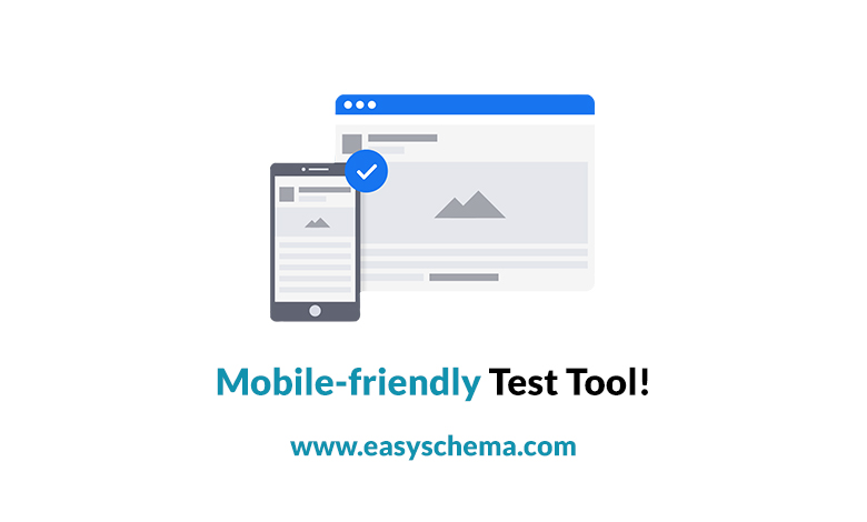
The search console’s Mobile-Friendly Test Tool is one of the easiest ways to find out whether a particular page is mobile-friendly or not.
Use Mobile Friendly Test Tool by Easyschema.com
How can you use the tool?
You can test if your site is mobile-friendly rapidly and efficiently. First, you have to type in the full URL of the web page that you want to try. This type of test will take you up to 1 minute to complete. The results of this test come with a screenshot of how the page looks to Google on a mobile device.
But there is more. These test results also include a list of any mobile usability issues it may detect. The most common usability problems that visitors may encounter are issues that can affect a user that visits the website on a small screen device. For example, small screens make small font size texts hard to read, and you aren’t able to use Flash as it isn’t supported by most of these mobile devices.
– If you can’t reach the page
For so many reasons, it might happen that the tool cannot access the page. In this case, it will display an error describing the problem and why the site is down. You should know that access problems also include network connectivity issues.
– If the website has problems with different loading resources
Know that you will get notification alerts (warnings) every time a test cannot load all resources used by a page. But what do we mean with resources? Resources are visible elements of the page like images, script files, and CSS.
This problem can happen for many causes:
- The resource didn’t load in a reasonable amount of time. That means that you have to rerun the test. If this doesn’t fix the problem, you must consider hosting the resource somewhere else. Another way to fix this is to try to discover and resolve the reason for the lack of response from the host.
- If a 404-error appears on the website, the resource does not exist in the location listed, so you have to fix the resource URL.
- The resource has no access to non-logged-in users. However, the test can access the page as an anonymous user and makes sure that all resources are accessible to anonymous users.
- If a resource on your site is blocked by a robots.txt. file, you can unblock it to GoogleBot. If the help is secured on another site, all you can do is contact the site’s webmaster and ask him to clear it.
Unblocking important resources
As we mentioned above, if you have a blocked resource, you might want to unblock it. However, if the resource that has been blocked is essential, this can cause chaos in how Google understands the page.
For instance, a blocked large image could make a page appear mobile-friendly even if it is not. Also, a secured CSS file could result in incorrect font styles being applied on a device. So, you always have to keep an eye open on these critical resources and check on them if they are accessible at any time.
Flaky test results. Page loading issues
If your page has problems with loading resources, you can notice different results every time you run the test. This happens because of the set of loaded resources on each test change. So, if your page rendering keeps changing every time you run the test, go and check for a “page loading issues” warning. You can provide more information on preventing your page from rendering correctly.
List of mobile-usability errors
Here are some errors you can identify by using the mobile-friendly test tool:
The use of incompatible plugins
You should know that many of the plugins (e.g., Flash) on the page are not supported by most mobile browsers. If this is the case, the only thing you can do is redesign your page using the latest web technologies broadly supported, like HTML5.
Establish viewport – not set
If the viewport is not set automatically, the test tool can not find a viewport property located on the page. This indicates browsers do not know how to adjust the pages on the screen size. You can imagine the wide range of devices a visitor might use, so obviously, they are ‘responsible’ for the page’s dimension and screen sizes (which are different from one device to another). Visitors can have access from small smartphones to tablets or large desktop monitors. That’s why It is so essential for your page to specify a viewport, and for that, you have to use a meta viewport tag.
Not adjusting viewport to device-width
Your page contains a fixed-width viewport property, which means it can not adjust for different screen sizes on other devices. This is an error that can be fixed. All you have to do is adopt a responsive design for your website’s pages. Then, set the viewport so you can match the device’s width and scale accordingly.
The content is wider than the screen.
Sometimes, you will need to scroll horizontally on your page to see full images and words to understand the content better. This error happens because pages use absolute values in CSS declarations. It also happens when pages use prints designed to look better on specific browser width, e.g., 980px. You can make sure the pages use relative width and position values for CSS elements. But you have to make sure images scale, as well.
Non-readable texts – too small
You know that sometimes the font size for the page is too small, making it difficult to read it. But what can you do to make it easily legible on a mobile device? That’s pretty easy. The first thing to do is specify a viewport for your web pages. Then set your font sizes to scale properly within the viewport.
Clickable elements – too close to each other
Being a mobile user, you may encounter many issues with the touch elements. For example, suppose buttons or navigational links are so close together. In that case, it is harder for a mobile user to click the desired element with their finger. That’s because it can accidentally tap another piece next to your target element. Of course, you have to fix this as quickly as possible, so your mobile visitors won’t have a bad experience while navigating on their devices. So, make sure to correctly adjust the font size, space buttons, and navigational links for your loyal visitors to navigate on your page.